CurrencyType Field 
The CurrencyType is a subset of the ChoiceType
that allows the user to select from a large list of 3-letter ISO 4217 currencies.
Unlike the ChoiceType, you don't need to specify a choices option as the
field type automatically uses a large list of currencies. You can specify the option
manually, but then you should just use the ChoiceType directly.
| Rendered as | can be various tags (see ChoiceType Field (select drop-downs, radio buttons & checkboxes)) |
| Default invalid message | Please select a valid currency. |
| Legacy invalid message | The value {{ value }} is not valid. |
| Parent type | ChoiceType |
| Class | CurrencyType |
Tip
The full list of options defined and inherited by this form type is available running this command in your app:
1 2 |
# replace 'FooType' by the class name of your form type
$ php bin/console debug:form FooType
|
Field Options 
choice_translation_locale 
type: string or null default: null
This option determines if the choice values should be translated into a different locale than the current one.
The values of the choice_translation_locale option can be null (reuse the current
translation locale) or a string which represents the exact translation locale to use.
Overridden Options 
choices
default: Symfony\Component\Intl\Currencies::getNames()
The choices option defaults to all currencies.
Caution
If you want to override the built-in choices of the currency type, you
will also have to set the choice_loader option to null.
choice_translation_domain
type: string, boolean or null default: false
This option determines if the choice values should be translated and in which translation domain.
The values of the choice_translation_domain option can be true (reuse the current
translation domain), false (disable translation), null (uses the parent translation
domain or the default domain) or a string which represents the exact translation
domain to use.
invalid_message
type: string default: This value is not valid
This is the validation error message that's used if the data entered into this field doesn't make sense (i.e. fails validation).
This might happen, for example, if the user enters a nonsense string into
a TimeType field that cannot be converted
into a real time or if the user enters a string (e.g. apple) into a
number field.
Normal (business logic) validation (such as when setting a minimum length for a field) should be set using validation messages with your validation rules (reference).
Inherited Options 
These options inherit from the ChoiceType:
error_bubbling
type: boolean default: false unless the form is compound
If true, any errors for this field will be passed to the parent field
or form. For example, if set to true on a normal field, any errors for
that field will be attached to the main form, not to the specific field.
expanded
type: boolean default: false
If set to true, radio buttons or checkboxes will be rendered (depending
on the multiple value). If false, a select element will be rendered.
multiple
type: boolean default: false
If true, the user will be able to select multiple options (as opposed
to choosing just one option). Depending on the value of the expanded
option, this will render either a select tag or checkboxes if true and
a select tag or radio buttons if false. The returned value will be an array.
placeholder
type: string or boolean
This option determines whether or not a special "empty" option (e.g. "Choose
an option") will appear at the top of a select widget. This option only
applies if the multiple option is set to false.
Add an empty value with "Choose an option" as the text:
「オプションを選択してください」という空の値をテキストとして追加します。1 2 3 4 5 6
use Symfony\Component\Form\Extension\Core\Type\ChoiceType; // ... $builder->add('states', ChoiceType::class, [ 'placeholder' => 'Choose an option', ]);Guarantee that no "empty" value option is displayed:
「空の」値オプションが表示されないことを保証します。1 2 3 4 5 6
use Symfony\Component\Form\Extension\Core\Type\ChoiceType; // ... $builder->add('states', ChoiceType::class, [ 'placeholder' => false, ]);
If you leave the placeholder option unset, then a blank (with no text)
option will automatically be added if and only if the required option
is false:
1 2 3 4 5 6 7 |
use Symfony\Component\Form\Extension\Core\Type\ChoiceType;
// ...
// a blank (with no text) option will be added
$builder->add('states', ChoiceType::class, [
'required' => false,
]);
|
preferred_choices
type: array, callable, string or PropertyPath default: []
This option allows you to display certain choices at the top of your list with a visual separator between them and the complete list of options. If you have a form of languages, you can list the most popular on top, like Bork and Pirate:
1 2 3 4 5 6 7 8 9 10 11 12 |
use Symfony\Component\Form\Extension\Core\Type\ChoiceType;
// ...
$builder->add('language', ChoiceType::class, [
'choices' => [
'English' => 'en',
'Spanish' => 'es',
'Bork' => 'muppets',
'Pirate' => 'arr',
],
'preferred_choices' => ['muppets', 'arr'],
]);
|
This options can also be a callback function to give you more flexibility. This might be especially useful if your values are objects:
1 2 3 4 5 6 7 8 9 10 11 12 13 14 15 |
use Symfony\Component\Form\Extension\Core\Type\ChoiceType;
// ...
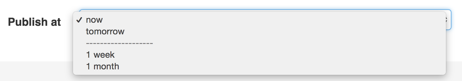
$builder->add('publishAt', ChoiceType::class, [
'choices' => [
'now' => new \DateTime('now'),
'tomorrow' => new \DateTime('+1 day'),
'1 week' => new \DateTime('+1 week'),
'1 month' => new \DateTime('+1 month'),
],
'preferred_choices' => function ($choice, $key, $value) {
// prefer options within 3 days
return $choice <= new \DateTime('+3 days');
},
]);
|
This will "prefer" the "now" and "tomorrow" choices only:
Finally, if your values are objects, you can also specify a property path string on the object that will return true or false.
The preferred choices are only meaningful when rendering a select element
(i.e. expanded false). The preferred choices and normal choices are separated
visually by a set of dotted lines (i.e. -------------------). This can be customized
when rendering the field:
-
Twig
小枝
-
PHP
PHP
1 |
{{ form_widget(form.publishAt, { 'separator': '=====' }) }}
|
Tip
When defining a custom type, you should use the ChoiceList class helper:
1 2 3 4 5 6 |
use Symfony\Component\Form\ChoiceList\ChoiceList;
// ...
$builder->add('choices', ChoiceType::class, [
'preferred_choices' => ChoiceList::preferred($this, 'taggedAsFavorite'),
]);
|
See the "choice_loader" option documentation.
trim
type: boolean default: false
Trimming is disabled by default because the selected value or values must match the given choice values exactly (and they could contain whitespaces).
These options inherit from the FormType:
attr
type: array default: []
If you want to add extra attributes to an HTML field representation
you can use the attr option. It's an associative array with HTML attributes
as keys. This can be useful when you need to set a custom class for some widget:
1 2 3 |
$builder->add('body', TextareaType::class, [
'attr' => ['class' => 'tinymce'],
]);
|
See also
Use the row_attr option if you want to add these attributes to
the form type row element.
data
type: mixed default: Defaults to field of the underlying structure.
When you create a form, each field initially displays the value of the corresponding property of the form's domain data (e.g. if you bind an object to the form). If you want to override this initial value for the form or an individual field, you can set it in the data option:
1 2 3 4 5 6 |
use Symfony\Component\Form\Extension\Core\Type\HiddenType;
// ...
$builder->add('token', HiddenType::class, [
'data' => 'abcdef',
]);
|
Caution
The data option always overrides the value taken from the domain data
(object) when rendering. This means the object value is also overridden when
the form edits an already persisted object, causing it to lose its
persisted value when the form is submitted.
disabled
type: boolean default: false
If you don't want a user to modify the value of a field, you can set the disabled option to true. Any submitted value will be ignored.
empty_data
type: mixed
The actual default value of this option depends on other field options:
- If
multipleisfalseandexpandedisfalse, then''(empty string);multiple が false で、expanded が false の場合、''(空の文字列); - Otherwise
[](empty array).それ以外の場合は [] (空の配列)。
This option determines what value the field will return when the submitted value is empty (or missing). It does not set an initial value if none is provided when the form is rendered in a view.
This means it helps you handling form submission with blank fields. For
example, if you want the name field to be explicitly set to John Doe
when no value is selected, you can do it like this:
1 2 3 4 |
$builder->add('name', null, [
'required' => false,
'empty_data' => 'John Doe',
]);
|
This will still render an empty text box, but upon submission the John Doe
value will be set. Use the data or placeholder options to show this
initial value in the rendered form.
If a form is compound, you can set empty_data as an array, object or
closure. See the How to Configure empty Data for a Form Class article for more details about
these options.
Note
If you want to set the empty_data option for your entire form class,
see the How to Configure empty Data for a Form Class article.
Caution
Form data transformers will still be
applied to the empty_data value. This means that an empty string will
be cast to null. Use a custom data transformer if you explicitly want
to return the empty string.
help 
type: string or TranslatableInterface default: null
Allows you to define a help message for the form field, which by default is rendered below the field:
1 2 3 4 5 6 7 8 9 10 11 12 13 |
use Symfony\Component\Translation\TranslatableMessage;
$builder
->add('zipCode', null, [
'help' => 'The ZIP/Postal code for your credit card\'s billing address.',
])
// ...
->add('status', null, [
'help' => new TranslatableMessage('order.status', ['%order_id%' => $order->getId()], 'store'),
])
;
|
6.2
The support for TranslatableInterface objects as help contents was
introduced in Symfony 6.2.
help_attr 
type: array default: []
Sets the HTML attributes for the element used to display the help message of the form field. Its value is an associative array with HTML attribute names as keys. These attributes can also be set in the template:
1 2 3 |
{{ form_help(form.name, 'Your name', {
'help_attr': {'class': 'CUSTOM_LABEL_CLASS'}
}) }}
|
help_html 
type: boolean default: false
By default, the contents of the help option are escaped before rendering
them in the template. Set this option to true to not escape them, which is
useful when the help contains HTML elements.
label
type: string or TranslatableMessage default: The label is "guessed" from the field name
Sets the label that will be used when rendering the field. Setting to false
will suppress the label:
1 2 3 4 5 6 7 8 |
use Symfony\Component\Translation\TranslatableMessage;
$builder
->add('zipCode', null, [
'label' => 'The ZIP/Postal code',
// optionally, you can use TranslatableMessage objects as the label content
'label' => new TranslatableMessage('address.zipCode', ['%country%' => $country], 'address'),
])
|
The label can also be set in the template:
-
Twig
小枝
-
PHP
PHP
1 |
{{ form_label(form.name, 'Your name') }}
|
label_attr
type: array default: []
Sets the HTML attributes for the <label> element, which will be used
when rendering the label for the field. It's an associative array with HTML
attribute as a key. This attributes can also be directly set inside the
template:
-
Twig
小枝
-
PHP
PHP
1 2 3 |
{{ form_label(form.name, 'Your name', {
'label_attr': {'class': 'CUSTOM_LABEL_CLASS'}
}) }}
|
label_format
type: string default: null
Configures the string used as the label of the field, in case the label
option was not set. This is useful when using
keyword translation messages.
If you're using keyword translation messages as labels, you often end up having
multiple keyword messages for the same label (e.g. profile_address_street,
invoice_address_street). This is because the label is built for each "path"
to a field. To avoid duplicated keyword messages, you can configure the label
format to a static value, like:
1 2 3 4 5 6 7 8 |
// ...
$profileFormBuilder->add('address', AddressType::class, [
'label_format' => 'form.address.%name%',
]);
$invoiceFormBuilder->add('invoice', AddressType::class, [
'label_format' => 'form.address.%name%',
]);
|
This option is inherited by the child types. With the code above, the label of
the street field of both forms will use the form.address.street keyword
message.
Two variables are available in the label format:
%id%-
A unique identifier for the field, consisting of the complete path to the
field and the field name (e.g.
profile_address_street);フィールドへの完全なパスとフィールド名 (例: profile_address_street) で構成される、フィールドの一意の識別子。 %name%-
The field name (e.g.
street).フィールド名 (通りなど)。
The default value (null) results in a
"humanized" version of the field name.
Note
The label_format option is evaluated in the form theme. Make sure to
update your templates in case you
customized form theming.
mapped
type: boolean default: true
If you wish the field to be ignored when reading or writing to the object,
you can set the mapped option to false.
required
type: boolean default: true
If true, an HTML5 required attribute will be rendered. The corresponding
label will also render with a required class.
This is superficial and independent of validation. At best, if you let Symfony guess your field type, then the value of this option will be guessed from your validation information.
Note
The required option also affects how empty data for each field is handled. For more details, see the empty_data option.
row_attr 
type: array default: []
An associative array of the HTML attributes added to the element which is used to render the form type row:
1 2 3 |
$builder->add('body', TextareaType::class, [
    'row_attr' => ['class' => 'text-editor', 'id' => '...'],
]);
|
See also
Use the attr option if you want to add these attributes to
the form type widget element.